
How to Use AI to Write Clearer Internal Policies Most internal policies are written by senior staff who’ve been using your systems for years. The result? Your company policies end up as dense, jargon-heavy documents that aren’t accessible to new staff. They’re hard to read, which makes them hard to follow, and that’s how policies…
Author Archives: Andrew Pegler
Someone told me last week that AI was going to replace what I do. I’ve spent twenty years and 250+ annual reports turning board papers, interviews and half-formed ideas into something people can actually understand. Apparently “prompt engineering” makes all of that obsolete. AI Is Literal. Your Instructions Need to Be Too AI is literal….
Most organisations treat the annual report as a publishing decision. PDF or digital. Static or interactive. In an era of digital-first communication, many organisations are determining whether to stick with a traditional static PDF or invest in an interactive annual report. That is the wrong frame. The real question is simpler and more commercial: How…
Most reports are well written. Many are well designed. But they’re still hard to use. For over 20 years, we’ve focused on one thing: making complex reports clear. That has meant better writing. Better structure. Better design. But how people use reports has changed. The real problem: annual reports are hard to navigate Annual reports…
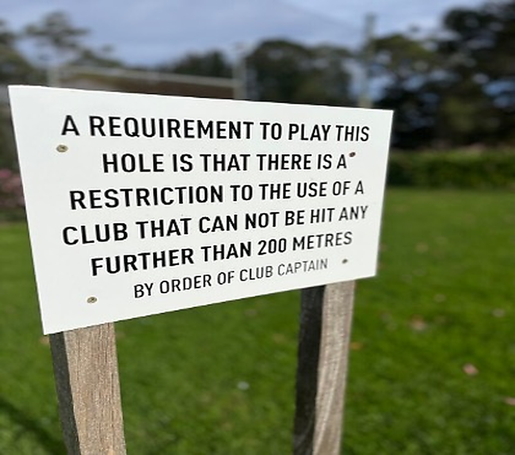
Or… just say: Don’t use a club that hits more than 200m on this hole. — Club Captain Spotted this on a recent work trip and thought hmmm….fourrrrrr! Helping golfers (and clubs) avoid accidental holes-in-one, one plain English edit at a time 🤣
Brevity is the currency of clear communication. And in annual report writing, what you leave out often matters more than what you put in. These are real examples of overwritten client-supplied copy that we’ve tightened this year with their full approval (and appreciation). A long sentence is not a deeper thought. If it reads like…
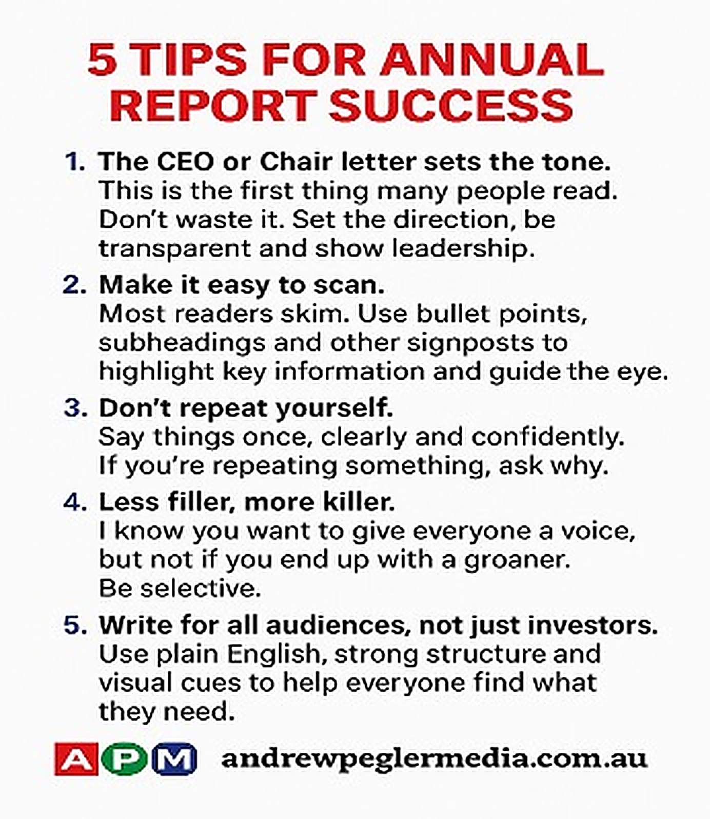
Being the lead judge of this year’s Plain Language Awards provides us all here with a timely reminder of what good annual reports read and look like. We work on annual reports all year round and the best ones always get the basics right i.e. clarity, structure and usability for a time poor audience. Here’s…
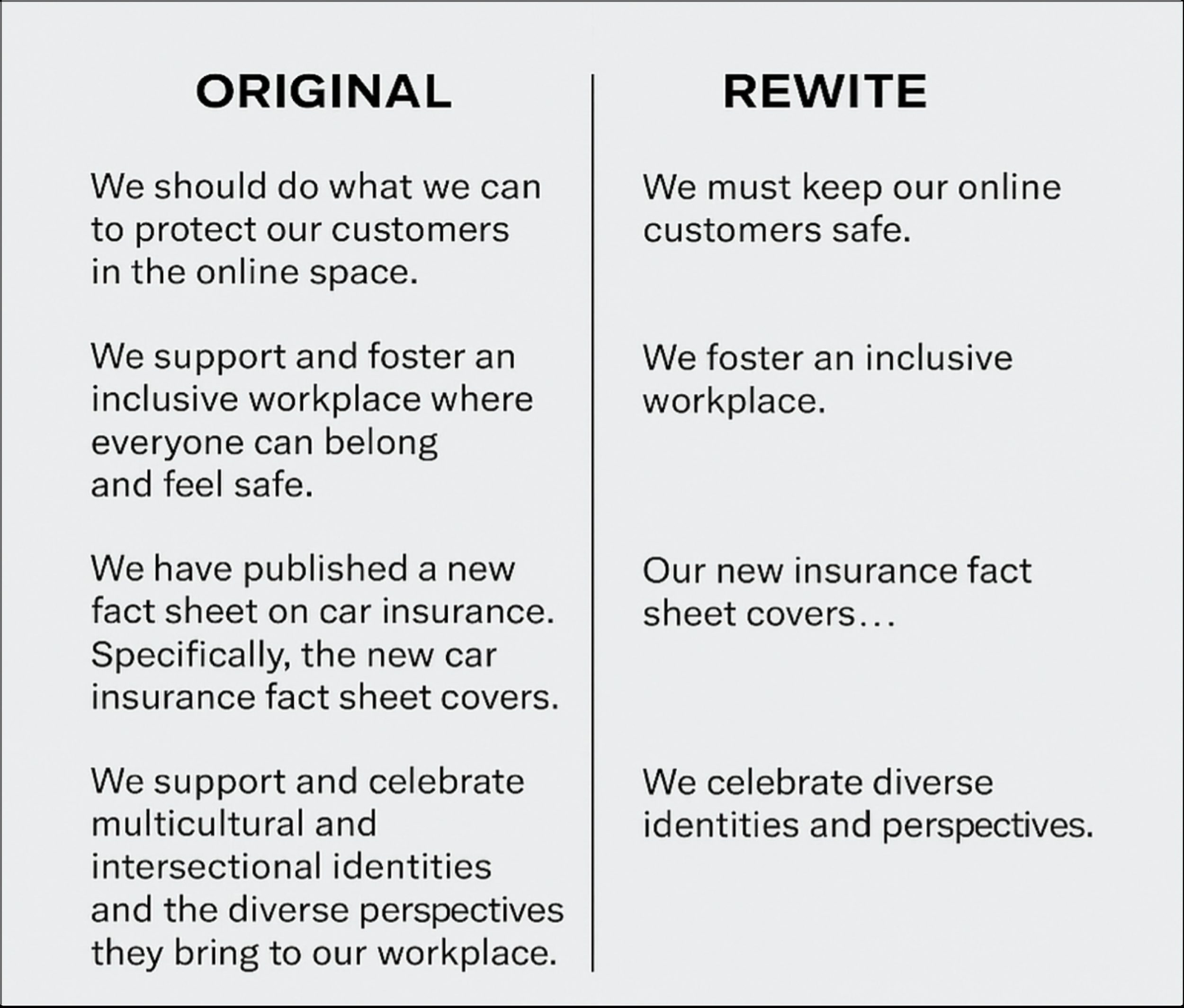
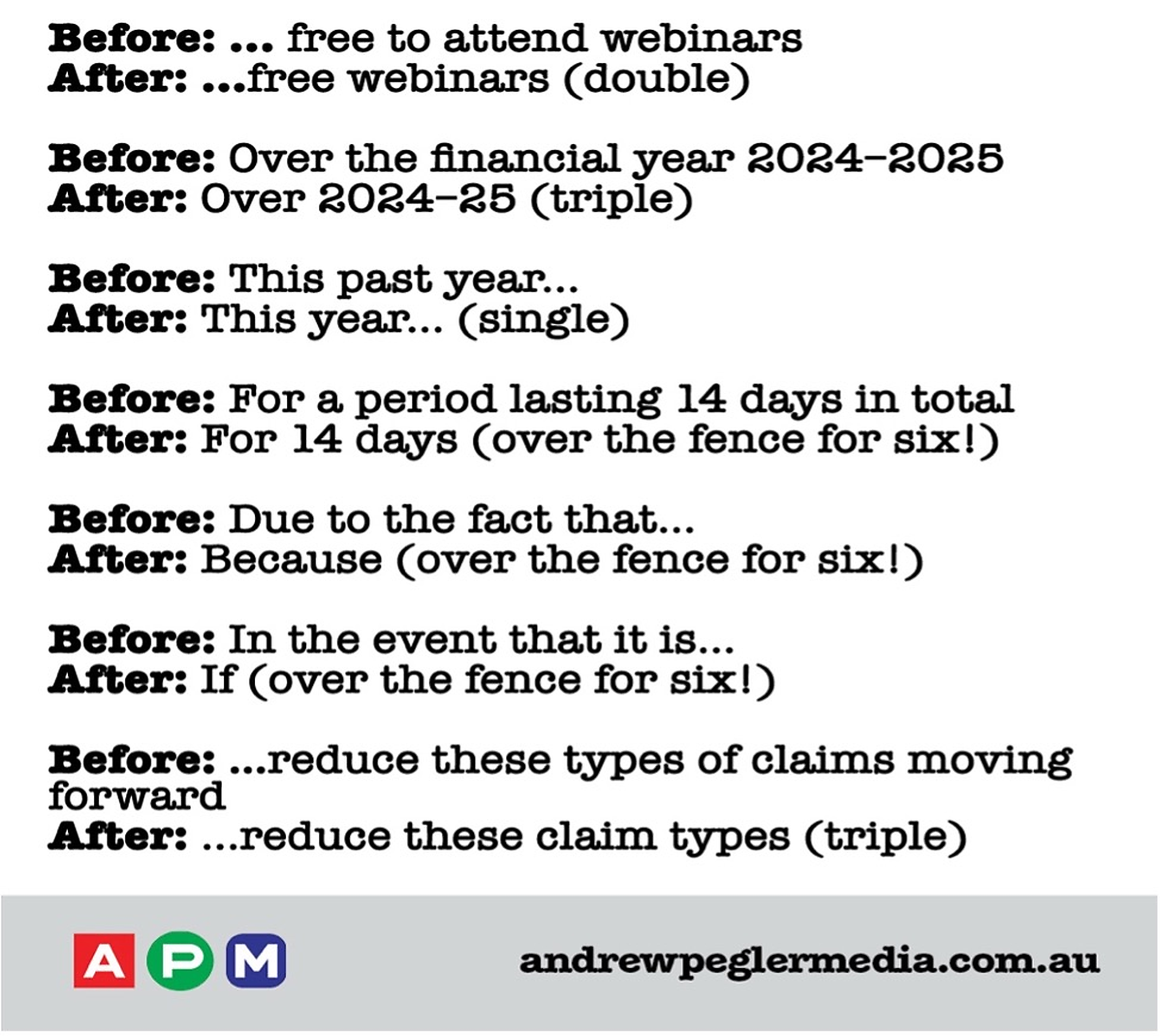
Over summer I collected a handful of overweight sentences andrewpeglermedia.com.au was working on – mostly for our calendar year annual report clients. They look fine at first glance, but carry more words than meaning. So we trimmed ’em back and reshaped them into clean, statuesque examples of #plainEnglish. This is the kind of small editing…
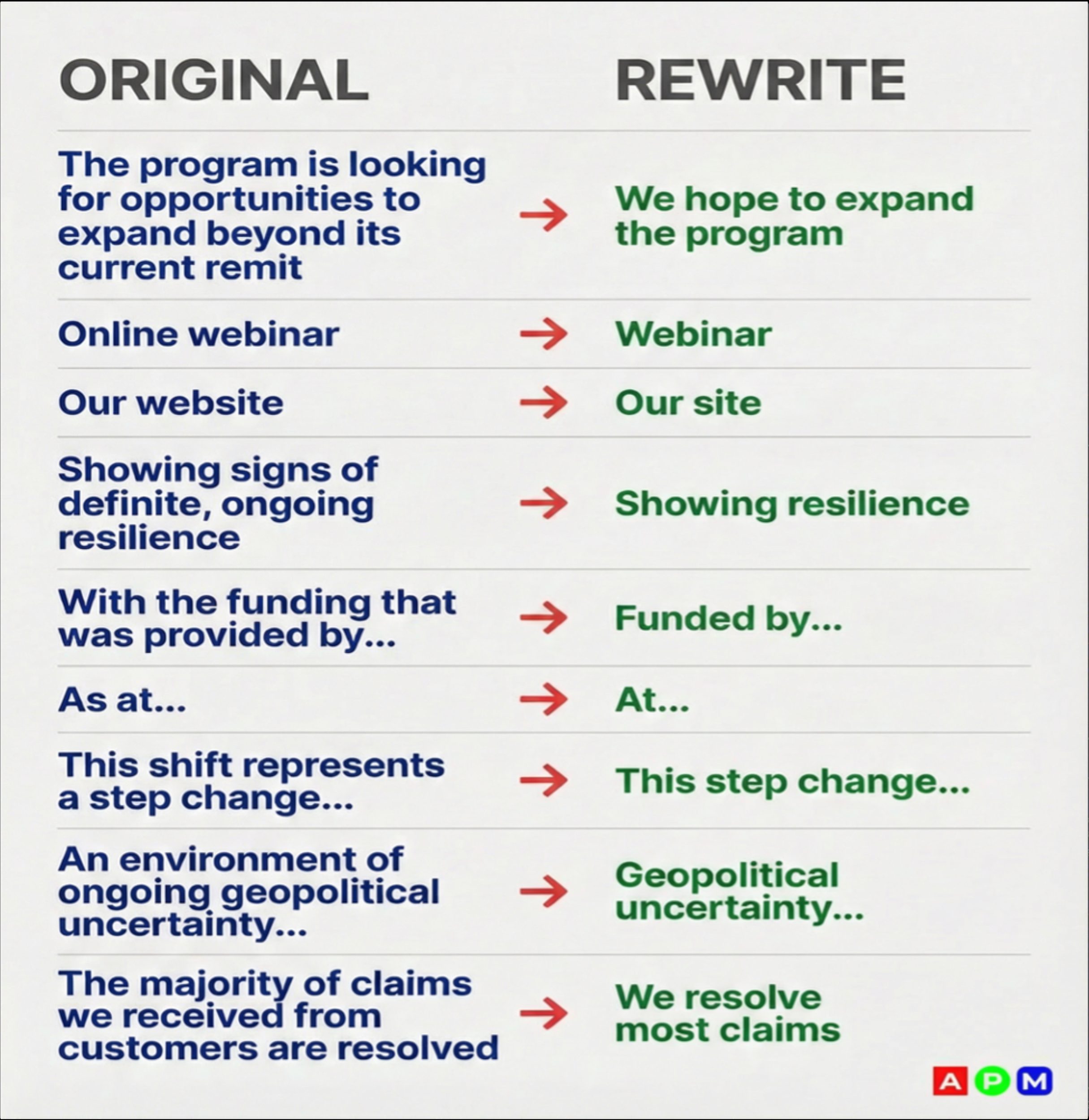
We had a long, supa busy annual report season, so I’ve been away from LinkedIn, deep in the plain-English trenches. But I’ve emerged with some things to share, which I’ll drip-feed over the next little while. I wanted to start small: what I call the grit between the bricks. The unnecessary words in a sentence….
At Andrew Pegler Media (APM), we’ve designed 250+ annual reports, sustainability reports and major government publications. What we’ve learnt is simple: annual report graphic design is not decoration. It’s about structure, clarity, trust and increasingly, the careful use of AI in annual reporting. This is the latest iteration of an annual report graphic design process…